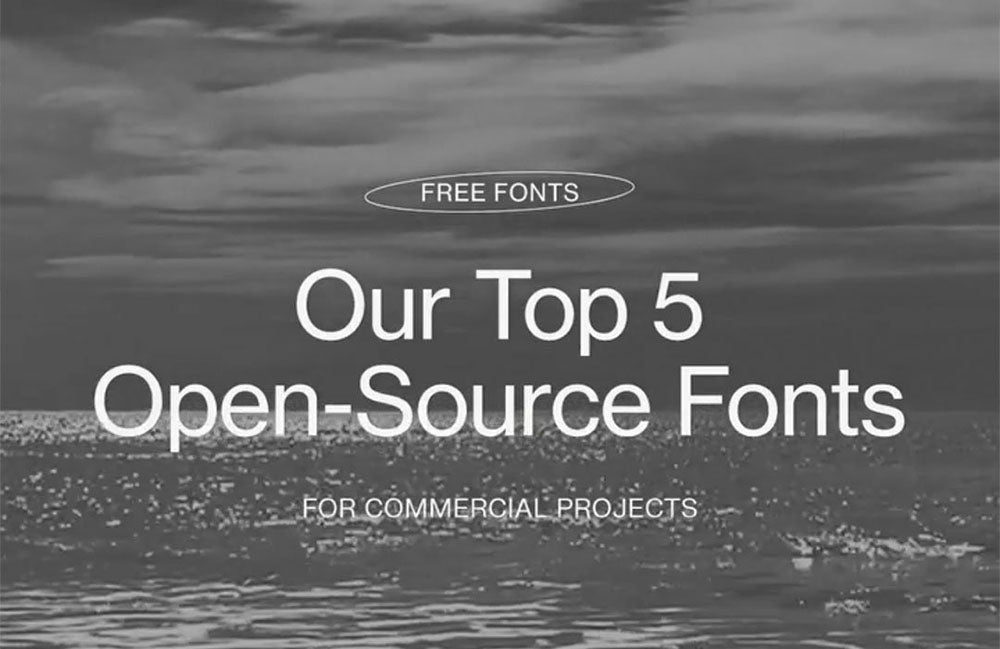
Our Favorite Open-Source (Free) Fonts – vol 001.
If you are reading this, you probably call on your inner font-snob from time to time. Fonts have always been an element that is often taken for granted but play a crucial role in communication and how it's received. Certain fonts can influence feelings, trigger emotions, and change behaviour of the audience.
As a font snob, this new series is dedicated to finding fonts across the web that just make you feel some type of way.
|
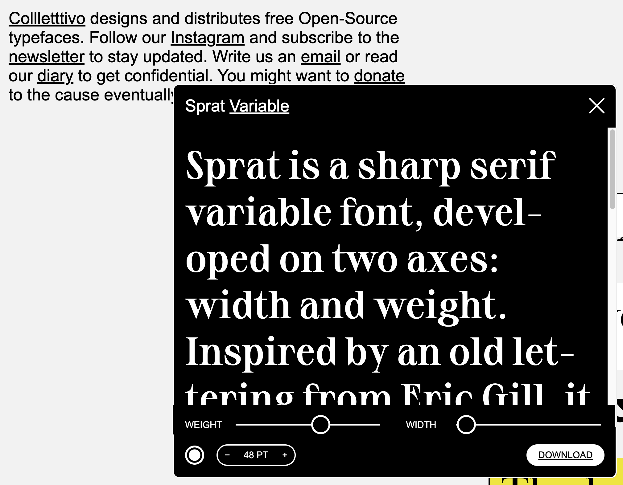
Collletttivo SpratInspired by an old lettering from Eric Gill, it features long sharps serifs, high contrast and round curves. |

|

|
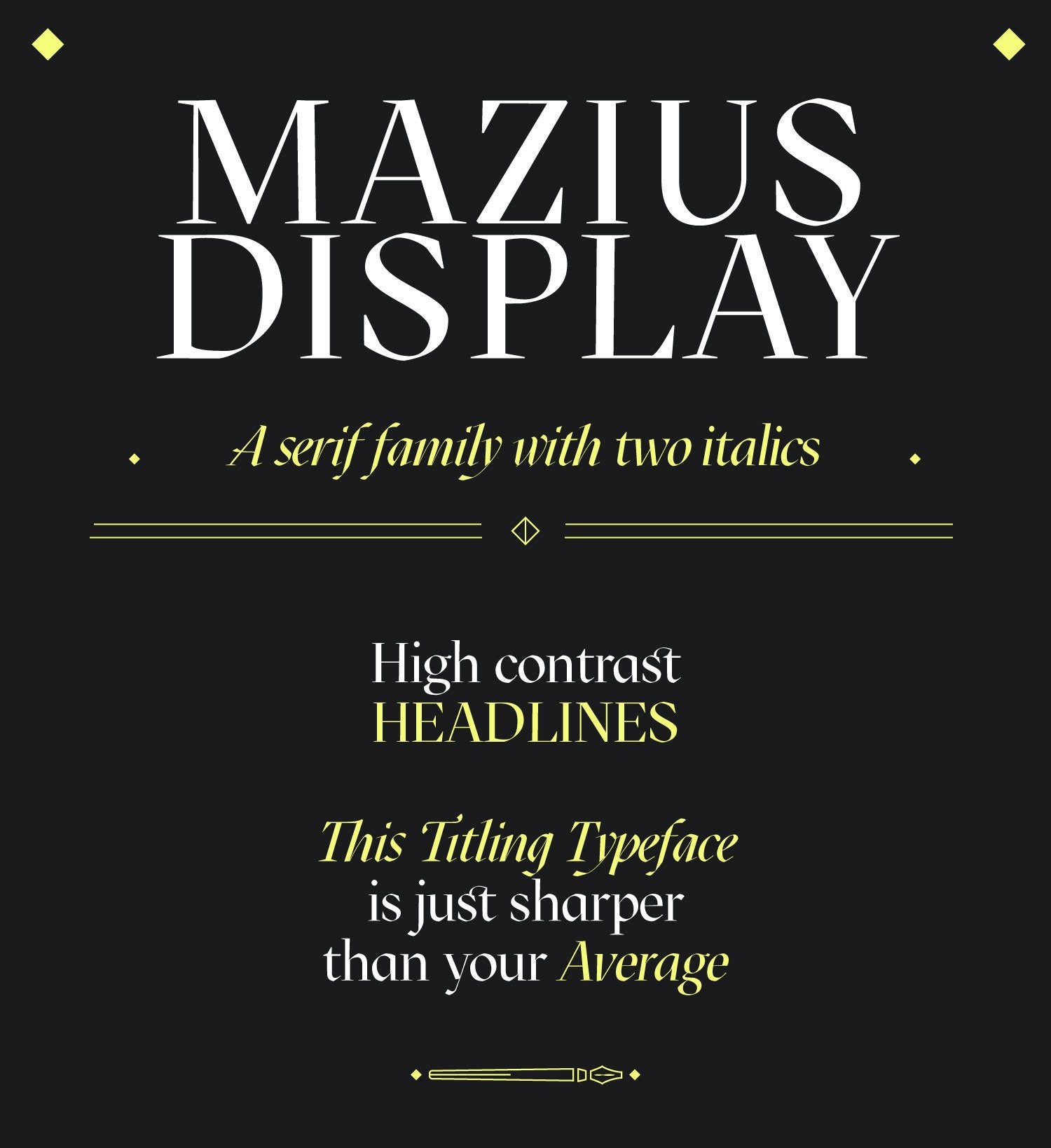
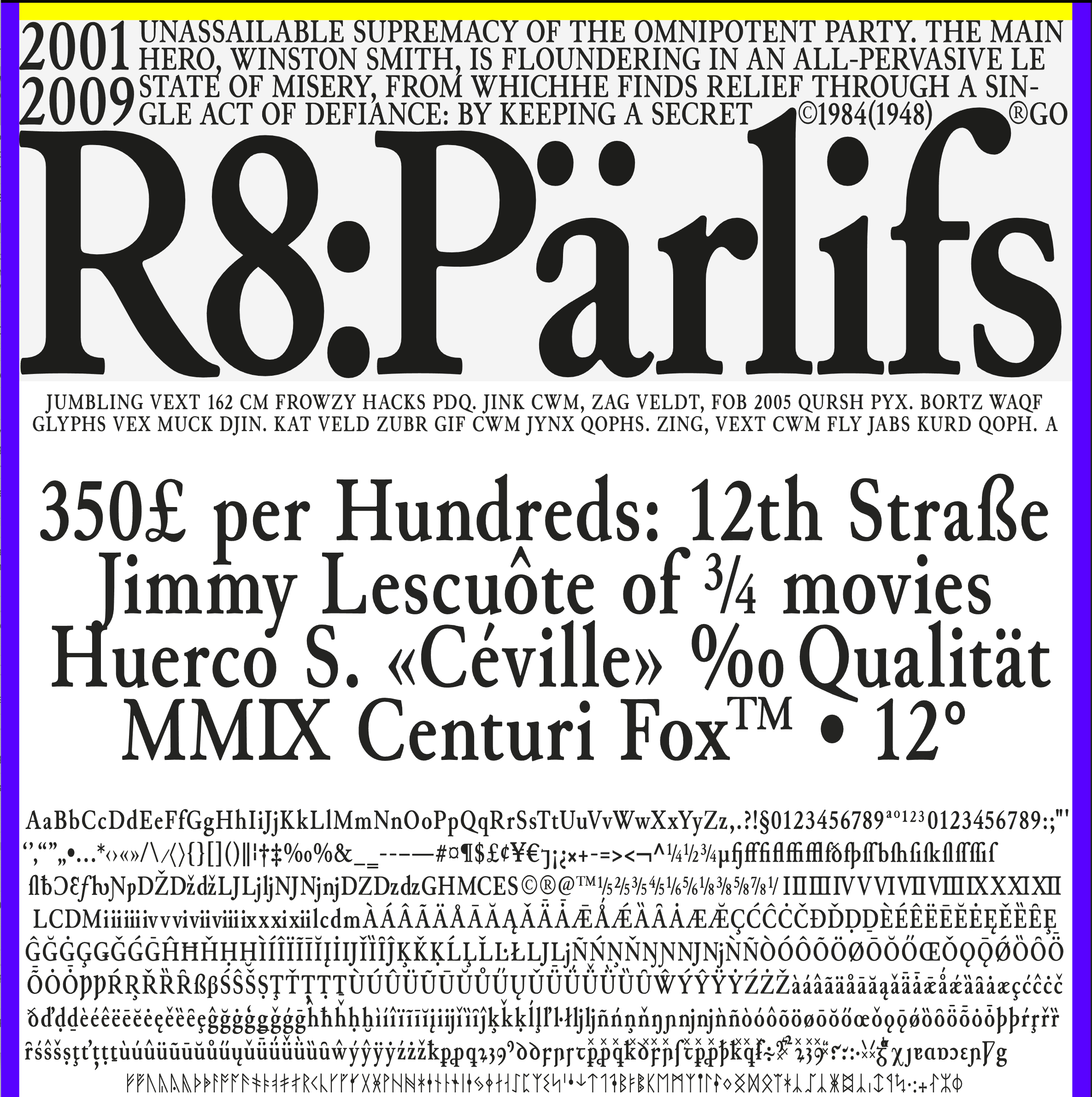
Collletttivo Mazius DisplayMazius is a high contrast serif typeface with old style proportions and a strong calligraphic feel. Influenced by chancery hands, it features two italics, each one with distinct personality. DOWNLOAD MAZIUS DISPLAY FOR FREE |